Best Practices for Designing Dashboards
Posted on October 1, 2018 by DEFTeamA Business Intelligence dashboard is a data visualization tool that displays the current status of metrics and key performance indicators (KPIs) for an organization. Dashboards consolidate and arrange facts, metrics, and performance KPIs on a single screen. A Business Intelligence dashboard is a tool which is easy to read, often a single page, real-time user interface showing a graphical presentation of the current status and historical trends of an organization’s key performance indicators to enable instantaneous and informed decisions to be made at a glance. Business Intelligence dashboard is a key to an organization’s insight. It’s an organization’s boon, but if made or used in a wrong way, it’s an organization’s nightmare.
In today’s world, every big, medium and small organizations use Business Intelligence. Dashboards comprise a major chunk of Business Intelligence. It’s of utmost importance that dashboards reveal most important information in a precise manner. Creating dashboards is an art where there is nothing wrong or nothing right. The dashboard will show only what you want it to show. Almost every BI tool allows us to create dashboards. Some are self-service BI tools like Tableau and QlikView, where users can create their own dashboards, and others are traditional tools like Jaspersoft, Pentaho, Cognos, etc., where BI developers create a dashboard. No matter who creates a dashboard, there are a few key points that we should keep in mind when creating it. These key points are what we call “Best practices” for creating dashboards and are golden rules which we have to keep in mind to make a dashboard useful.
10 Golden Rules for Dashboard Design:
- Information should be concise, clear and accurate. Too little information will make the feature all but useless and too much will make for a good manager’s meeting conversation piece but will actually render the dashboard cumbersome to use.
- Limit the information to what’s necessary.
- Add related KPIs in one dashboard and select the right metrics.
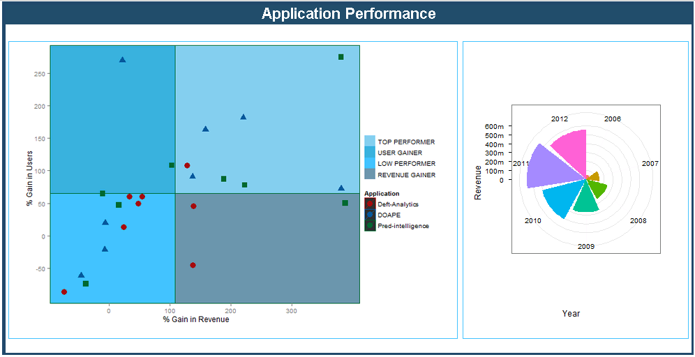
- Highlight the data which is important, like the top performers, top sellers, etc.
- Avoid too much information on a single dashboard; it can detract from the importance of the data.
- Avoid overwhelming and distracting visuals.
- Decide the time interval at which the data on the dashboard needs to be refreshed.
- Always take inputs from the end users and take feedback.
- Manage the real state of the dashboard effectively to avoid scrolling.
- The dashboard should be visually appealing, effective and practical.