Data Visualization Best Practices: Part 2 – Choosing Line Chart or Bar Chart
Posted on August 30, 2018 by DEFTeamLine and Bar charts are the most common types of charts used in BI reports and dashboards. In the given figure below, there are three line charts. Try to figure out which of these Data Visualization choosing line chart or bar chart are inappropriate.
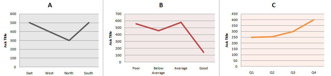
Line charts should be used when quantitative variables change over a period of time, as they helps in discovering trends.
In the first two charts, the x-axis is represented by categorical variables, which are nominal (Chart A) and ordinal (Chart B) in nature.
Bar chart is preferred for qualitative variables as they help in making comparison across different categories.
In the first two charts, bar chart should be used instead of a line chart, as trends across different categories do not help in decision-making.
Third chart (Chart C) helps in discovering an upward trend for the measure used over a period of time. So a line chart should be preferred based on best practices.
For given dataset, different visualizations can be used, but not all visualizations help in making better decisions. So it’s recommended to follow best practices.
In the next post, we will post a series of charts and you have to decide which chart type to use based on best practices.