Quiz on Best Practices in Data Visualization
Posted on August 30, 2018 by DEFTeam-
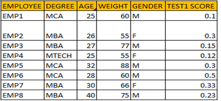
List all the possible combinations for drawing a scatterplot for given data with best practices in Data Visualization.
-
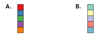
Your manager has asked you to make a presentation that will be showcased to more than 100 people. Which color palette would be more appropriate for the given audience?
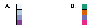
Which color palette would you choose for making a heatmap?
-
For the given data, which chart type would you choose?

Do you think 3D charts should be used in Data Visualization?
Answers are given below:
- A scatterplot is drawn between two quantitative variables. So combinations are – Age&Weight, Age&TestScore1, Weight&TestScore1.
- Option B. 10-12% of the people are colorblind. So we have to choose a color palette which is color-blind friendly.
- Option A.
- Horizontal column chart.
- 3D charts are not preferred as they are hard to read and interpret.