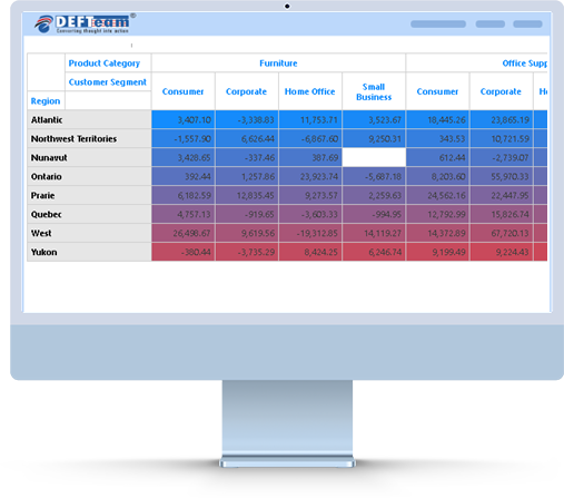
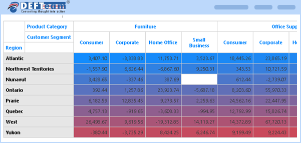
A Heatmap Chart in Power BI Visuals is a two-dimensional chart that uses color to represent data. It is used to identify patterns in large amounts of data. The color of each grid element in the Heatmap Chart is based on the value in the corresponding cell in the underlying data table. Heatmap Charts can be used to visualize correlations between different data points and can be used to compare across different categories and timeframes.
Using the Heatmap Custom Visual in Power BI can help business users to:
- Identify correlations and trends in their data.
- Allow them to make better decisions.
- Also help them to identify areas of improvement and optimize their operations.
The Heatmap custom visual is a great tool for business users to gain insights from their data.
Hierarchical Heatmap Visuals Features Developed by DEFTeam
- Supports interactivity.
- Enhanced formatting options.
- Slice & Dice capabilities.
- Supports hierarchical data on both X and Y axis.
Frequently Asked Questions
- Heatmap Visual is licensed per-user, per-month basis.
- We strongly recommend to install Heatmap visual in organization custom visual repository.
- This feature allows users to get access to custom visual and receive the updates automatically when uploaded by Power BI Admin.
- Kindly email all your issues to support@defteam.com.
- We are here to stay. In an unlikely event DEFTeam will release the source code of the chart.
- No, we currently do not provide a perpetual license. However, if the number of users exceeds 10,000 you can contact sales@defteam.com for more detail.
Download and Try It Today.
Heatmap Visual is a powerful tool to visualize correlation and trend in the data, identify area of improvements to optimize the operation and better decision-making.