Power BI Stacked Clustered Chart
Visualize, compare, and analyze: Unleash the power of stacked and clustered data in one chart.
Overview
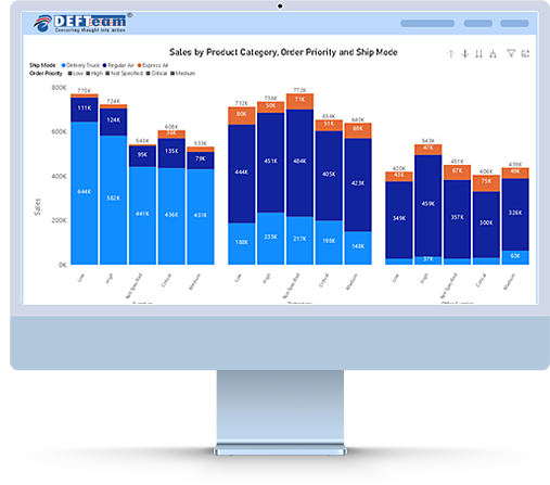
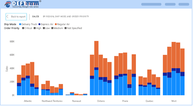
The Stacked Clustered Chart for Power BI is a powerful custom visual that combines the benefits of both stacked and clustered chart types into a single, intuitive visualization. It is perfect for showing how different categories contribute to a total value across multiple clusters. This chart is ideal for business analysts and decision-makers who need to visualize multiple series of data in a way that is easy to interpret and compare.
5000+
Downloads
Trusted by
Dive Deeper Into Your Data
Stacked clustered visual provide business users with a powerful and flexible way to visualize and analyze complex data sets. By leveraging stacked clustered visual, business teams can make more informed decisions, identify trends and patterns, and drive greater success in their respective fields.
Key Features
Combined Cluster and Stack View
The Stacked Clustered Chart combines the clarity of clustered columns with the detailed view of stacked bars, making it perfect for showing proportions and comparisons side by side.
Flexible Grouping
Allows users to define multiple dimensions (or categories) for both the clustering and stacking axis, enabling deeper insights.
Benefits
Better Comparison
Quickly compare values across different categories or time periods while also visualizing the composition of each cluster.
Enhanced Data Storytelling
Use the stacked feature to highlight how parts of a whole contribute, while the clustered feature ensures that overall comparisons are clear.
Efficient Use of Space
The chart is space-efficient, enabling you to visualize multiple data series without overwhelming your report with too many visuals.
Interactive Reports
Users can click on any cluster or stacked section to drill down for more detailed analysis, enhancing the interactivity of your reports.
Use Cases
1. Sales Performance
Compare sales by product categories across different regions or time periods. Use the stacked feature to see how individual products contribute to the total sales in each region or period.
2. Budget Analysis
Visualize expenses by department (clusters) and the type of expenses (stacked segments) within each department for more insightful budget tracking.
3. Market Share
Track market share by product or service across multiple markets or competitors, showing both the total size of each market and the contribution of each product or competitor.
4. Yearly Analysis
Display sales or revenue data year-over-year, with each stacked segment representing a different product or service to see how the composition changes over time.
Frequently Asked Questions
- The clustered stacked bar is licensed on a per-user, per-month basis.
- Amount charged for license is on yearly basis.
- We strongly recommend to install stacked clustered bar chart in organization custom visual repository.
- This feature allows users to get access to custom visual and receive the updates automatically when uploaded by Power BI Admin.
- Kindly email all your issues to support@defteam.com.
- We are here to stay. In an unlikely event DEFTeam will release the source code of the chart.
- No, we currently do not provide a perpetual license. However, if the number of users exceeds 10,000 you can contact sales@defteam.com for more detail.
Download and Try It Today.
The Stacked Clustered Chart is a powerful tool for anyone looking to make data comparisons clearer and easier to understand. Whether you're tracking sales performance, financials, or market trends, this custom visual will add significant value to your Power BI reports.